De
sign
Design is part of our DNA, we are completely aware that a project stems from a great design. To this end, we first meet the customer and gather as much information as possible.
It is crucial that the customer takes part in defining the project, because at the end of the day it is his or her company. We make suggestions and the customer decides.
For us, the design has to reflect the company’s core values and its philosophy.
Overall, this is what we refer to as “THE CONCEPT”.
We develop the design based on 5 vertices:
- Customer Briefing
- Definition
- Functionality
- Investment
- Legislation
AXA
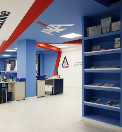
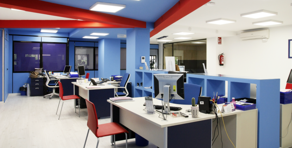
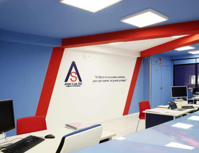
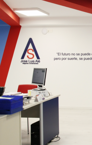
This Design project was carried out for AXA. In this project, we have prioritized “the implementation” of AXA’s logo and the customer usability. This is why we decided – after having analysed the company’s corporate identity – to design this office around AXA’S logo and its colours.
We used the red line of their logo to project a red beam on the ceiling to hide the technical installations. The final result is a translucent place: bright, cheerful and harmonic. This workplace generates a positive working environment and makes an impression on AXA’s clients.
MEZ
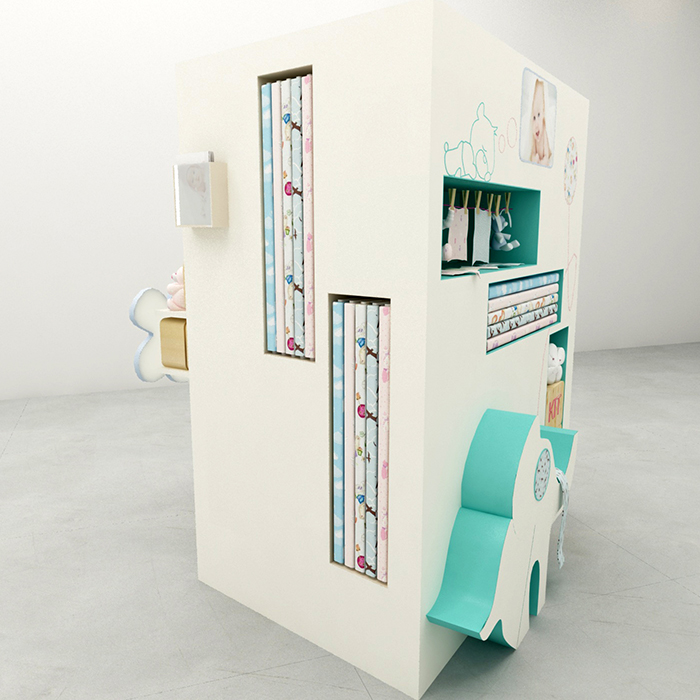
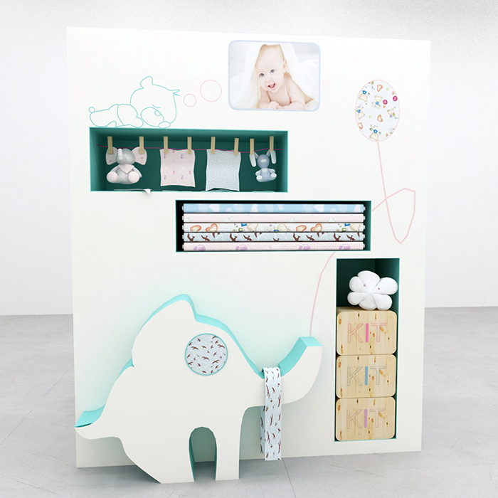
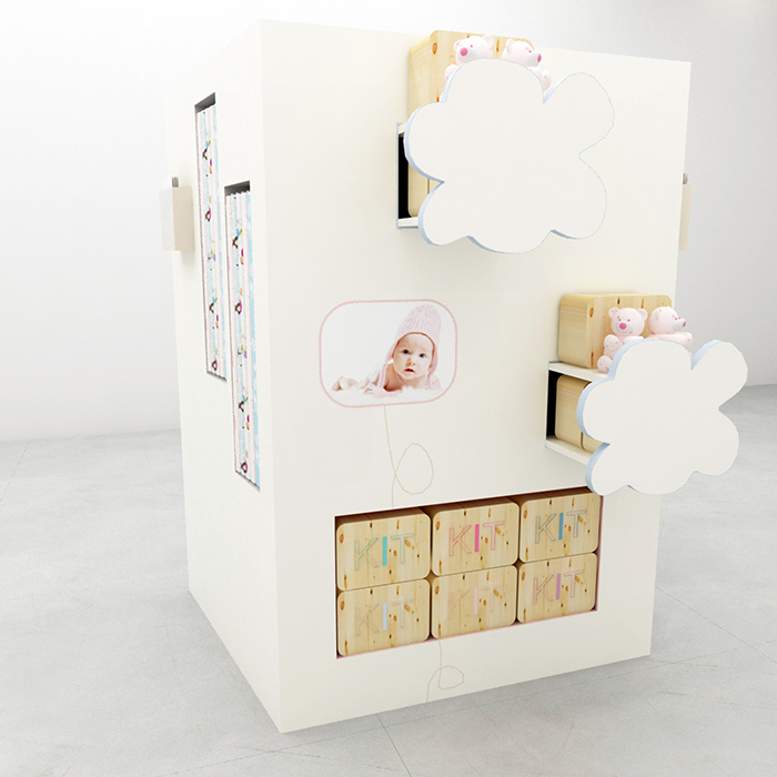
Design of an exhibition panel for a children’s product line under the brand “patchwork”. Our aim was to create an easily recognizable element for the salesroom of any shop, whether standing alone in the middle of a room or along a wall. Therefore we designed an exhibition piece with baby photos, spaces for the cloths and kits as well as samples of works presented with the cloths on display to (further) personalize the showroom case.
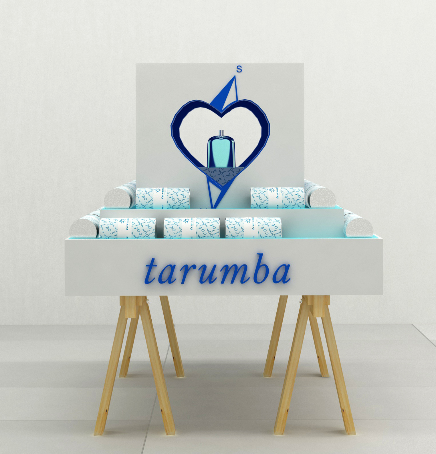
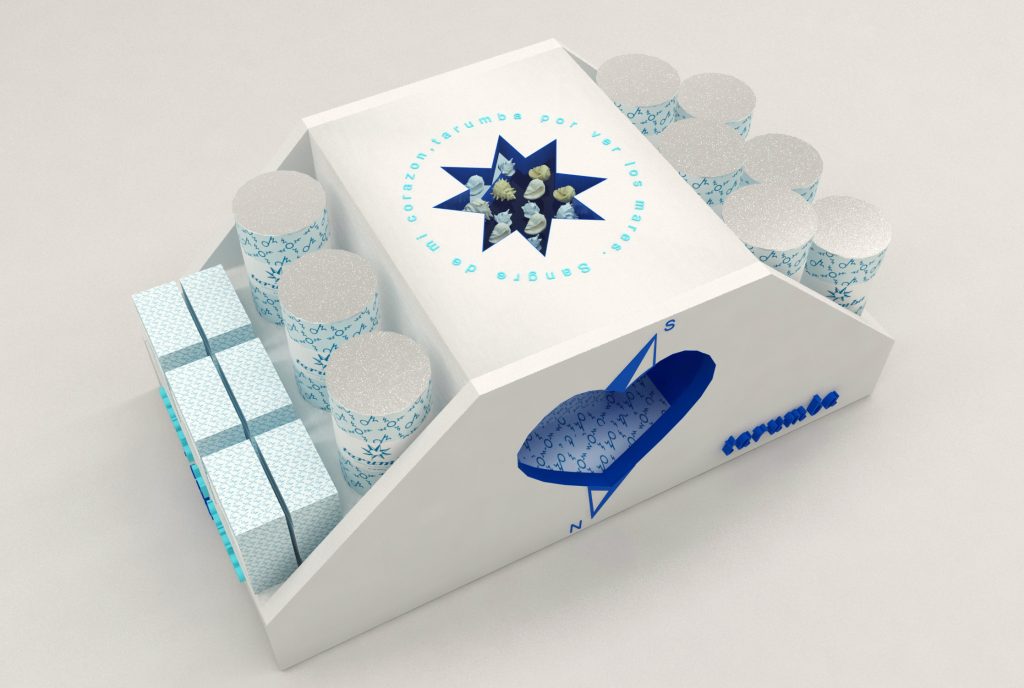
TARUMBA
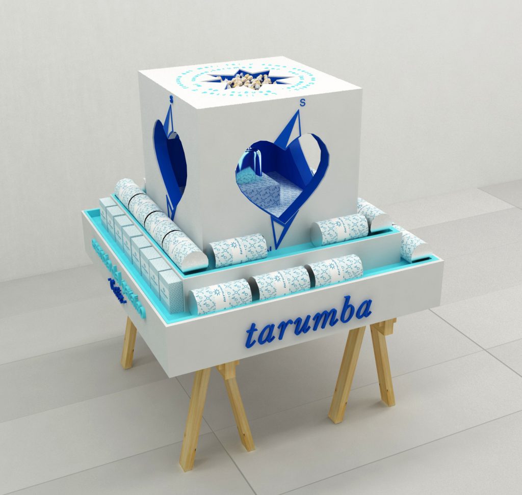
Designing an showroom case for a line of perfumes. The exhibition piece itself converts into an additional packaging element, perfectly fulfilling its mission: attracting and convincing potential customers, protecting the integrity of its interior, and also transmitting the brand’s values.
